This is the culmination of playing MK8D for an entire day(I do not recommend this). We wanted to determine what we thought the best maps in MK8D were and rank them accordingly.
For each map we played, we ranked it in the tier list below based on its fun factor, aesthetic, and overall gameplay, all of which are entirely subjective.
Tier List
(Tier list used from tiermaker.com)
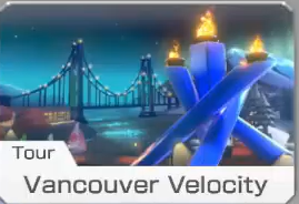
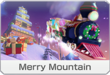
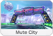
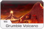
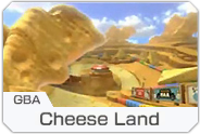
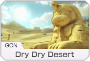
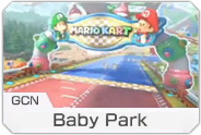
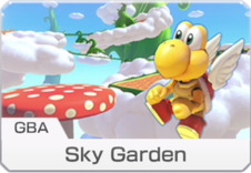
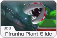
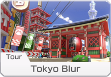
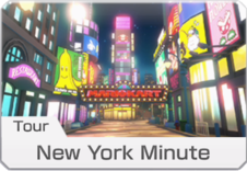
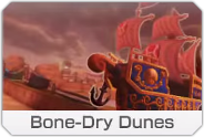
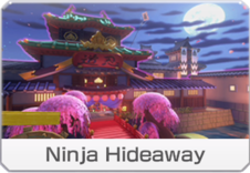
S
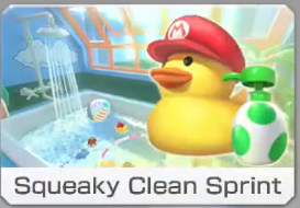
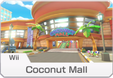 A
A
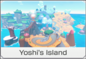
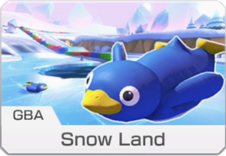

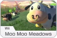
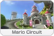
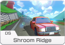
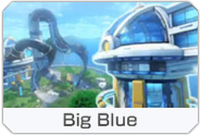
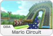
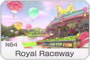
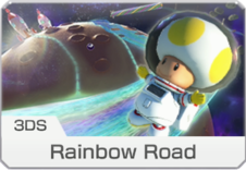
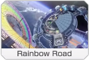
 B
B
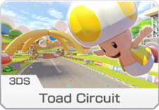
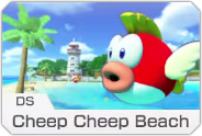
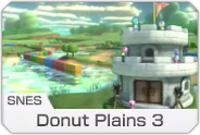
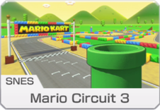

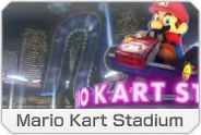
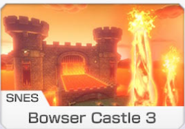
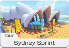
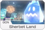
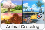
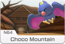
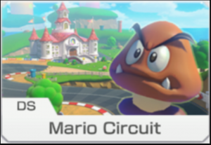
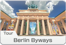
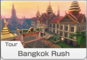
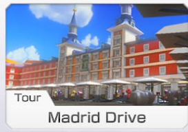
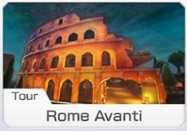 C
C
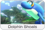
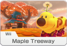
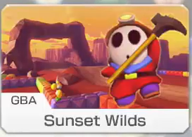
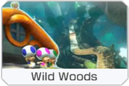
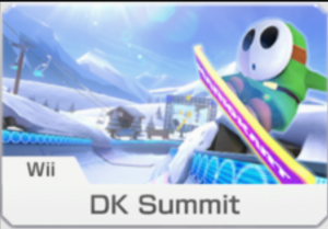
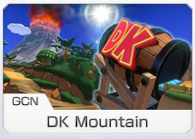
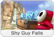
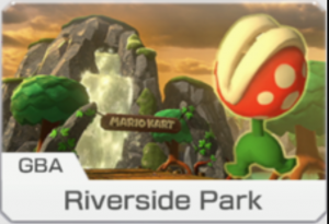
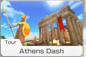
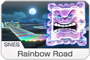
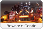
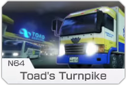
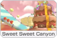
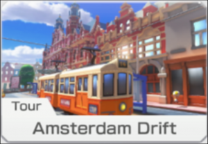
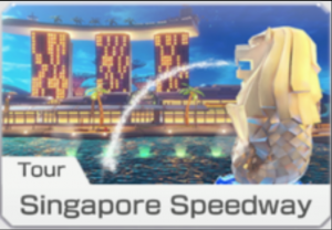
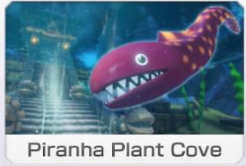 D
D
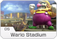
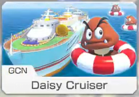
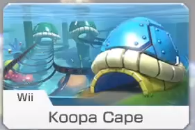
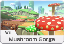
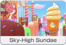
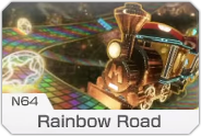
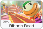
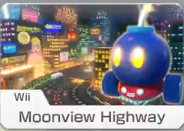
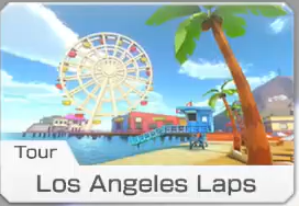
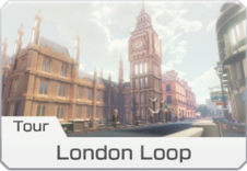
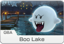
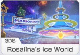
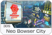
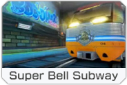 F
F
Map rankings and placement
Table 1:
This table shows our relative placement and points scored for each map in the game.
Placement and point analysis
Table 2:
Based on our placements on all the maps, this show the number of times we placed in each position and percentage accordingly.
Figure 1:
Mapping the percentage of times we placed in each position, we can see some nice distributions in our placements!
Cup rankings and time analysis
Table 3:
Now mapping our rankings to each cup, we found our percieved most favorite and least favorite cups.
There is also some time analysis to see how long each cup ideally takes to complete.
It is interesting to see that the maps we liked the most were on average the slowest maps compared to the ones we liked the least! --------------->
For each map we played, we ranked it in the tier list below based on its fun factor, aesthetic, and overall gameplay, all of which are entirely subjective.
Tier List
(Tier list used from tiermaker.com)
S
A
B
C
D
F
Map rankings and placement
Table 1:
This table shows our relative placement and points scored for each map in the game.
Placement and point analysis
Table 2:
Based on our placements on all the maps, this show the number of times we placed in each position and percentage accordingly.
Figure 1:
Mapping the percentage of times we placed in each position, we can see some nice distributions in our placements!
Cup rankings and time analysis
Table 3:
Now mapping our rankings to each cup, we found our percieved most favorite and least favorite cups.
There is also some time analysis to see how long each cup ideally takes to complete.
It is interesting to see that the maps we liked the most were on average the slowest maps compared to the ones we liked the least! --------------->
S
A
B
C
D
F